New single-handed clinic
Four pages, prices published, and a booking button on every screen
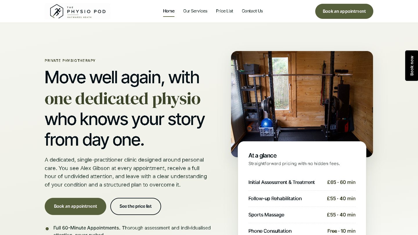
A new clinic treating on weekday evenings and Saturday mornings, with no receptionist and no gap between patients. Four pages carry the whole business: what is treated, what it costs, when it is open, and a booking button that never leaves the screen.
 Open thephysiopod.co.uk ↗
What they came to us with
A physiotherapist opening a practice alongside NHS work, treating from a room in Haywards Heath on weekday evenings and Saturday mornings. There is no receptionist and no time between appointments, so a website whose main output was phone calls would have been a liability from the first week.
A brand-new clinic also has nothing to trade on except clarity. Somebody choosing between an established practice and a name they have never seen needs to know what is treated, what it costs and who is treating them, inside the first minute.
What they got
Answering the three questions everybody has
- Six areas of work, each with its own card and explanation: musculoskeletal problems, sports injuries, post-operative rehabilitation, sports massage and soft tissue therapy, strength and conditioning, and movement screening.
- Every price published on its own page, including the free ten-minute phone consultation, with session lengths beside them so nobody is comparing an hour against forty minutes.
- The practitioner's NHS and elite-sport background on the homepage, with the HCPC registration number in the footer of every page, so a patient can check the register in under a minute.
- Payment methods, insurance and the cancellation terms written down, so a late cancellation is a rule the patient already read rather than an awkward conversation.
Getting booked without a phone call
- A booking button fixed to the edge of the screen on every page, plus one in the header, both opening the clinic's real diary.
- An enquiry form for the people who want to ask something first. It lands in the inbox at no cost per enquiry and confirms on the page, so nobody is left wondering whether it sent.
- The form still works with JavaScript switched off, because a form that silently fails on an older phone is worse than no form.
- Arrival instructions in plain words: where to park, that the practitioner meets you outside at the appointment time, the few steps to the room, and not to arrive more than five minutes early.
Built to be read on a phone at nine in the evening
- Pages appear immediately on mobile data, which matters most for a clinic whose patients are looking after work.
- Opening hours, address and phone number in the footer of all four pages, so the answer is never more than one screen away.
- Type and spacing chosen for reading rather than for a design portfolio, at a size that works without pinching.
- Nothing that follows a visitor around the internet afterwards, so the site needs no cookie banner arguing with the reader before they have read anything.
Cheap to own, and it stays that way
- No monthly website subscription, no page limit and no charge for adding a service later.
- The domain, the site and the booking account are all in the clinic's name, so nothing here can be held over the owner.
- Search engines are given a proper map of the site, and each page states its own address to them, so the same page is never counted twice.
- Four pages is four pages to keep current. A clinic open fifteen hours a week can actually maintain that.
How we went about it
A new single-handed clinic does not need a page for everything. It needs four that are complete, current and honest, which is worth more than twenty half-written ones.
The most common reason an enquiry never arrives is that the cost is hidden. Putting the fee schedule on the page filters out the wrong conversations and speeds up the right ones.
The diary link went live before the design was finished, because that is the only part of the site that produces an appointment.
Where a real detail did not exist yet, the page carried a visible marker saying so. Nothing invented could ship by accident, and the launch checklist wrote itself.
What we would tell you before you start
What decides a launch like this is the booking link. Somebody who finds the clinic at nine in the evening books at nine in the evening or forgets about it, and no amount of design changes that.
The site is deliberately small and it will grow from evidence. Once there are a few months of search data, the pages worth adding are the ones people were already looking for, which is a better list than any we would have guessed at launch.
Find out what your clinic is missing
A free 20-minute review of your website, Google Business Profile, reviews and booking flow. You get a written summary of what to fix first, whether or not you work with us.